Skyscanner
UX Research, Accessibility design, UI, Design System, Systems thinking, White labelling, Google Console, API integration
100 million users
Desktop, mobile web, android, iOS (pins only)
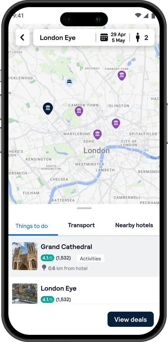
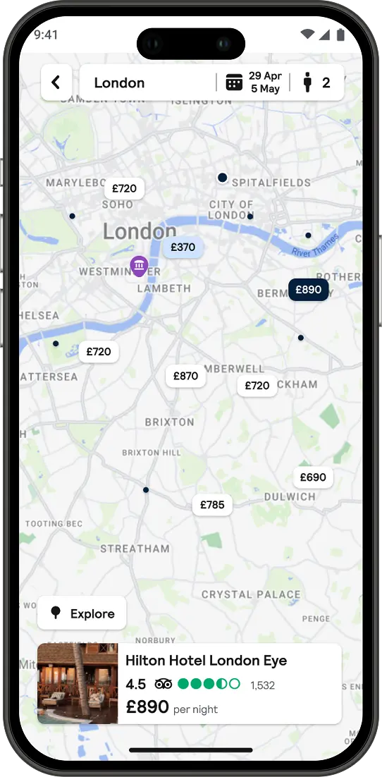
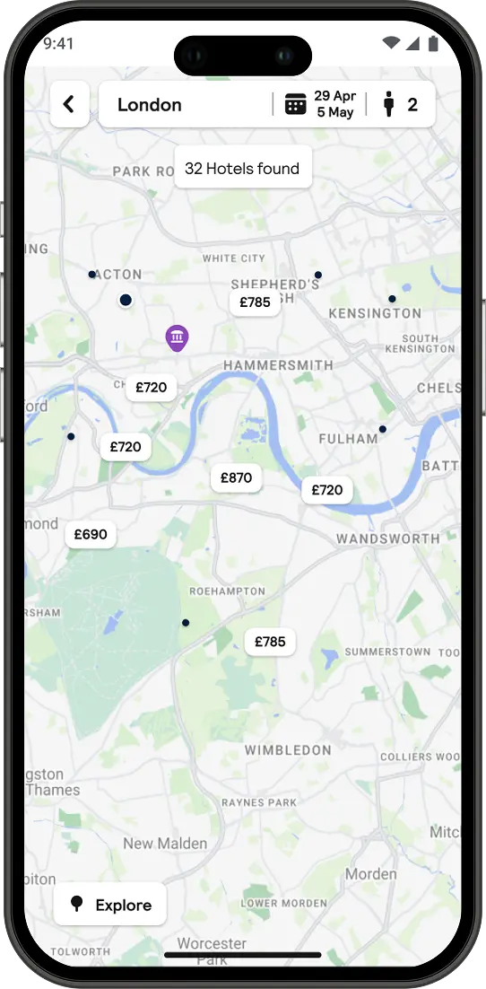
Revitalising the Skyscanner map interface for an enhanced user experience with a focus on interaction design and usability.
This involved the planning and redesign of Maps and the integration into Backpack Design System library.
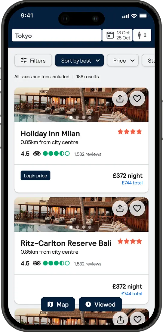
User engagement with the Skyscanner Map experience was disappointingly low, with only 25% interaction on desktop and a mere 6.9% on the app. Typically used by users who browse it indicated a significant usability issues. Upon closer examination, several key problems emerged. The map's cluttered design overwhelmed users with excessive information, hindering their ability to effectively search, discover, and narrow down travel options. Users struggled to interact with the map due to unclear visual cues, feedback mechanisms and pin clustering logic.
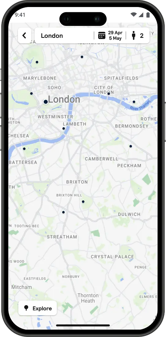
To combat these issues, the goal was to prioritise decluttering and visual clarity on the maps.
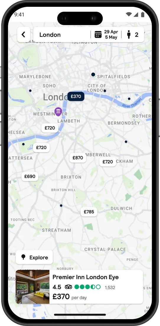
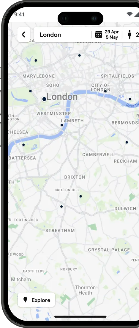
This involved implementing a collaborative horizontal alignment. This project had enriched our Backpack Design System library with new colour tokens and map components. I designed a new Google Map skin with a streamlined colour palette complementing Skyscanner's branding and introducing a clear visual hierarchy. With a focus on interaction, an intelligent clustering logic was implemented for a smoother experience alongside visual affordance and feedback mechanisms.
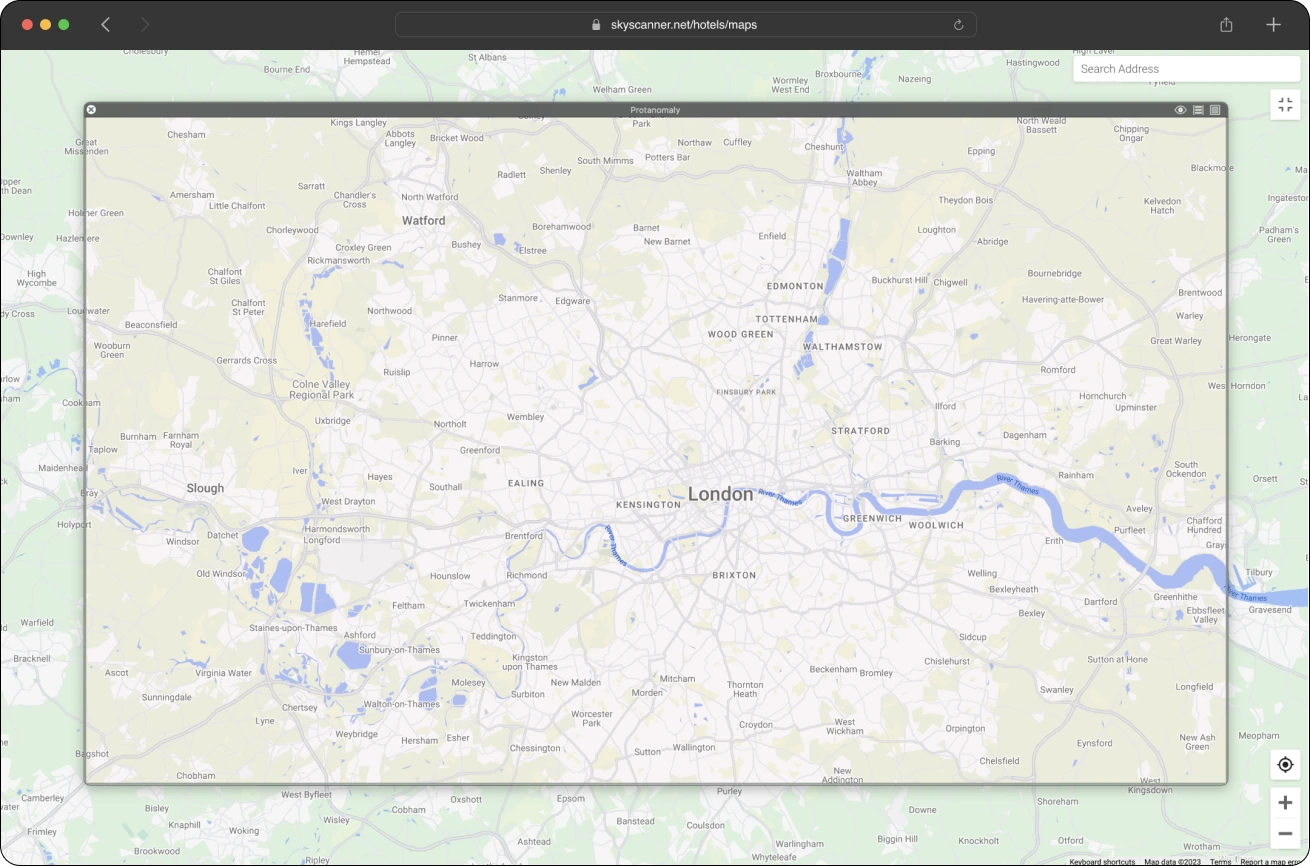
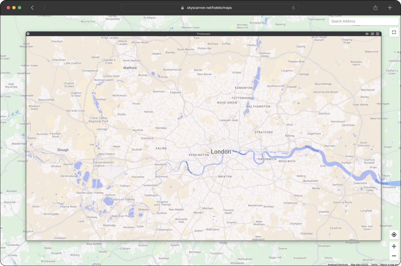
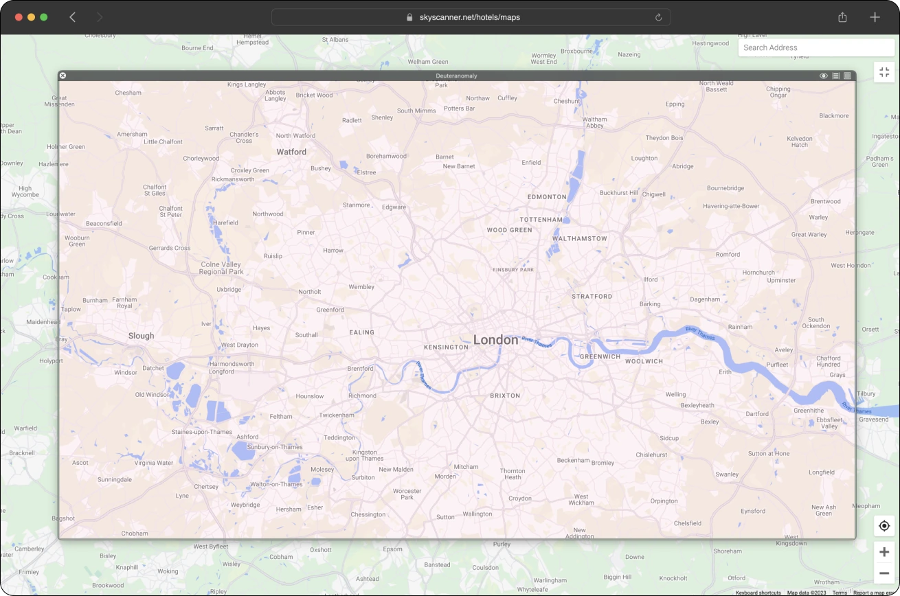
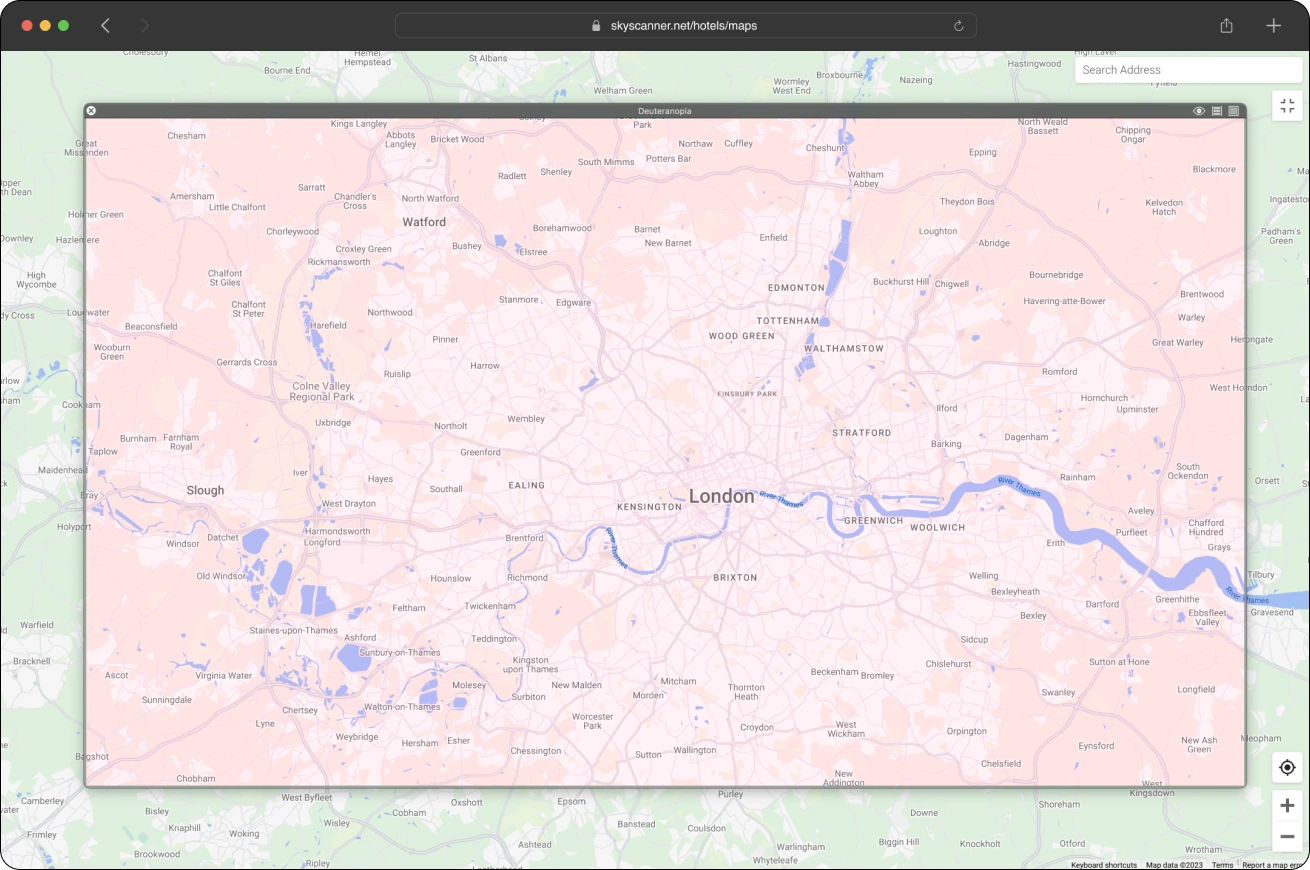
Colour Blindness types
Protanomaly
Protanopia
Protanomaly
Protanopia
Colour Blindness Testing Insights
Removing reds
By removing red hue I found the interaction and movement on maps more frictionless with this subset of travellers.
Greys
On observation with the various depths of greys used Travellers found the hierarchy in urban areas’ as ‘very clear’ by 78%.
Greens
Received well. With 90% of travellers able to distinguish between the landscape and urban areas
Additional Info: Product attributes
The difference between sub-cats did not make an impact in the various greens used.
Accessibility was also a major concern, with inadequate provisions for individuals with colour blindness or low vision. So, Accessibility required a strategy that prioritised due to the lack of established benchmarks for assessing colour contrast in map interfaces in the design industry, I gathered data and establish benchmarks for users by user testing with the Sim Daltonism Web app.
Day mode - Updates


Night mode - Updates


- On average, we saw an 20% uplift in engagement with the time spent on the map experience on desktop.
- Click through rate increased to 32% entering the PDP page.
- The redesign delivered its most significant gain on mobile web, driving a massive 50% uplift in map engagement among unauthenticated users
.webp)
