Skyscanner
UX Research, Horizontal Design Collab, IA, Accessibility design, UI, Design System, A/B testing, Conversion
100 million
Desktop, mobile web and app
Unifying five separate checkouts (flights, hotels, car hire) into a single, transparent One Page Checkout. The goal was to minimise friction and address a lack of total cost transparency. The new design showed significant results, including a 32% reduction in abandonment on desktop and uplift in revenue per session.
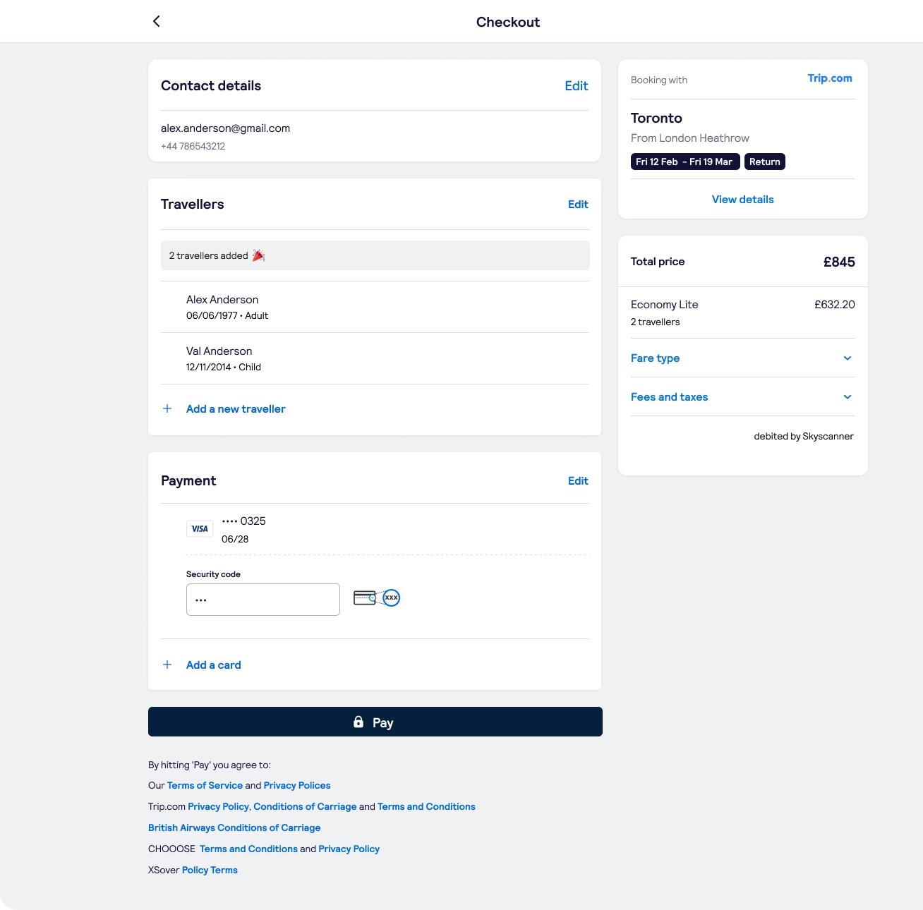
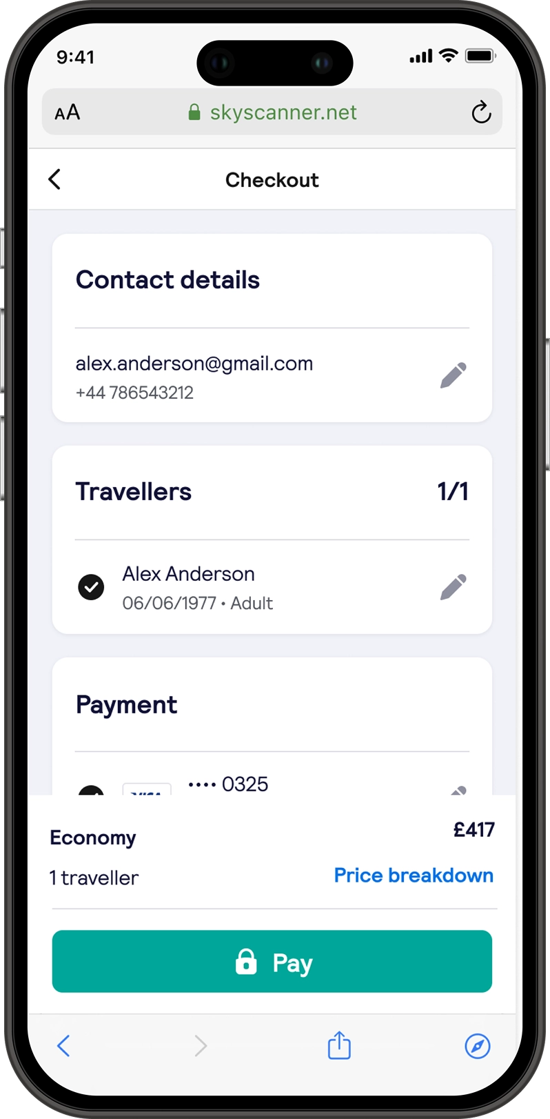
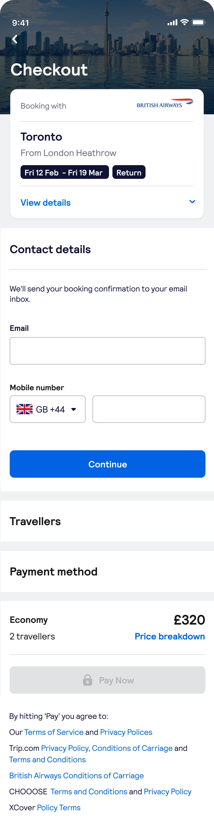
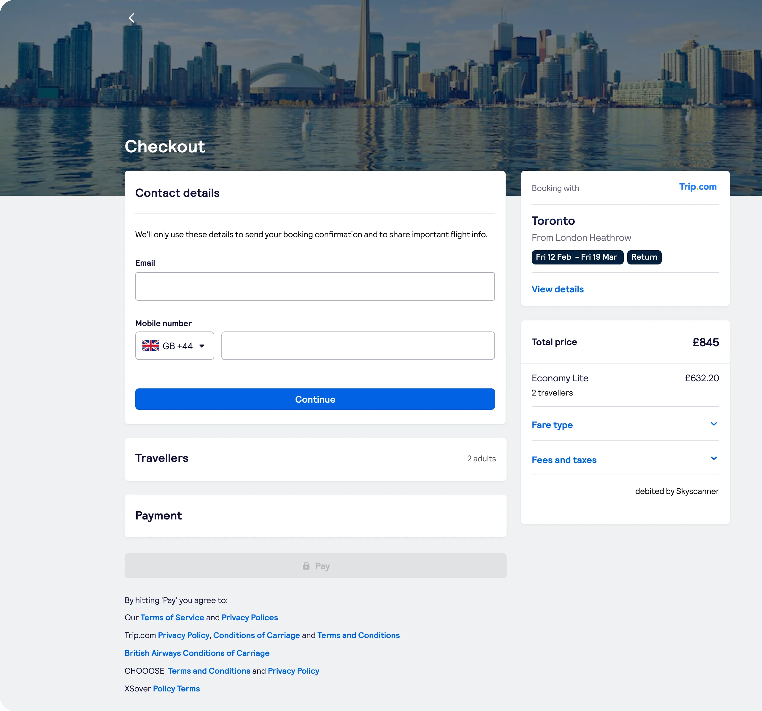
The Skyscanner checkout experience presented several key challenges from a product design perspective. The existence of five separate checkouts for flights, hotels, and car hires created inconsistencies and inefficiencies for users. Each checkout model had unique friction points, including issues with navigation, micro-interactions, animation, information architecture, and hierarchy. The existing design did not adequately address Skyscanner's specific user needs, particularly in areas like error handling and clearly displaying the total booking cost upfront. This lack of transparency often led to traveller frustration and booking delays.
To improve the user experience, Skyscanner's checkout process was completely redesigned with a focus on creating a single, unified, and transparent process.
This streamlined approach simplified booking across all product offerings by consolidating five separate checkouts into one intuitive flow a 'One Page' Checkout with stateful panels and progressive disclosure techniques with smooth transitions and animations was implemented to minimise friction and cognitive load for the traveller after an heuristic evaluation and several user tests were completed. The direction addressed the IA of the checkout notably providing a clear breakdown of all costs without requiring exhaustive user input.
%201%20(2).gif)

.webp)


Rigorous A/B testing was conducted to de-risk revenue impact and validate design decisions along the way.
.webp)
The implementation of the Flights Checkout in 2023 yielded significant, measurable results within three months, showcasing the effectiveness of the simplified, brand-agnostic design.
- Global Checkout Abandonment Reduction: Desktop saw a notable -32% reduction in global checkout abandonment.
- Revenue Growth: Revenue per session increased, driven primarily by strong performance in EMEA markets.
- United Kingdom, Germany, and France saw revenue per session growth by 2% to £0.20.
- The Netherlands saw growth by 2.13% to £0.26.
- This regional upturn significantly contributed to overall conversion.
- Mobile Engagement: Across both iOS and Android platforms, the overall product attach rate experienced an uplift of 20%.
The success of the brand-agnostic, simplified design proved highly scalable. Its ease of application allowed for accelerated cross-platform implementation across other verticals, specifically Hotels and Car Hire.
.webp)